
Lighting Basics · 8 min read
What 3000K Really Means
3000K describes the colour appearance of light, but it does not tell you whether a room will feel comfortable, flattering or well lit. Here is what to consider beyond the Kelvin number.
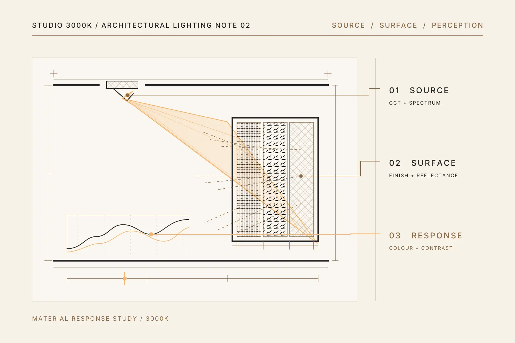
The name Studio 3000K reflects our preference for warm, comfortable residential lighting. It does not mean that every light in every home should be 3000K.
Colour temperature is an important starting point, but it is only one part of how a space looks and feels. Two lights can both be labelled 3000K and still produce noticeably different results. One may make timber, skin tones and fabrics look rich and natural. The other may feel flat, slightly green or unexpectedly harsh.
Colour temperature only makes sense when you consider the room, how it is used and its materials.
What does 3000K mean in lighting?
Correlated colour temperature, or CCT, is expressed in kelvin and describes the apparent tint of white light. Within common residential ranges, lower CCTs appear warmer or more golden, while higher CCTs appear more neutral or cooler. CCT is separate from brightness. A 3000K source can be bright or dim, just as a 4000K source can be bright or dim.
The most common residential options are:
| Colour temperature | General appearance | Typical applications |
|---|---|---|
| 2700K | Warm, golden and intimate | Bedrooms, decorative lamps and relaxed evening spaces |
| 3000K | Warm, but less golden than 2700K | Living rooms, dining rooms, bedrooms and feature lighting |
| 3500K | Between warm and neutral white | Contemporary living spaces, studies and multi-use rooms |
| 4000K | Neutral white in appearance | Kitchens, utility areas and some workspaces |
These are useful starting points, not fixed rules. The same colour temperature can feel different depending on the light level, wall colour, materials and time of day.
2700K vs 3000K vs 3500K vs 4000K
2700K: relaxed and atmospheric
2700K is close to the familiar warmth of traditional incandescent lighting. It can make bedrooms, lounges and decorative fittings feel calm and intimate.
However, it is not automatically the best choice for every residential space. Against white stone, pale grey finishes or a clean contemporary kitchen, some people may find 2700K too yellow. It can still support detailed tasks when enough light reaches the work surface and glare and colour rendering are well controlled. CCT alone does not determine task visibility.
3000K: warm without being overly golden
3000K is popular because it sits in a useful middle ground. It retains a warm residential character while appearing less golden than 2700K.
It often works well with timber, warm ivory walls, bronze finishes, natural stone and neutral fabrics. In many living and dining spaces, it provides warmth without the stronger amber cast some people perceive at 2700K.
3500K: a useful bridge
3500K is often overlooked. It can be a strong option for contemporary homes where 3000K feels a little too warm but 4000K feels too clinical.
It can suit living areas that double as work or activity spaces, particularly when the interior palette includes cooler neutrals. It may also help connect a 3000K living room with a 4000K kitchen in an open-plan home.
4000K: more neutral in appearance
4000K provides a more neutral appearance, which some homeowners prefer in kitchens. It does not automatically improve task visibility. Light level, placement, uniformity, glare control and colour rendering are more important.
That does not mean every kitchen must be 4000K. A timber-heavy open kitchen connected directly to a warm living room may work better at 3500K, or with carefully coordinated layers. The decision depends on the materials, layout and relationship between adjoining spaces.
Why Kelvin alone does not determine lighting quality
Choosing a colour temperature is not the same as designing the lighting. Several other factors can change the result.
Brightness and light levels
Kelvin does not measure brightness. The light reaching a surface depends on the fitting’s output and distribution, together with its quantity, spacing, aiming, mounting distance and reflected light from surrounding surfaces.
A high-output 3000K downlight can feel harsher than a lower-output 4000K fitting. Conversely, too little warm light can leave a room looking dull rather than atmospheric.
The aim is not simply to make the room bright. It is to provide the right amount of light where it is needed.
CRI and R9
The Colour Rendering Index, usually stated as CRI Ra, estimates average colour fidelity against a reference source of comparable CCT. For residential lighting, we generally start at CRI 90 or above.
The headline number does not tell the full story. CRI Ra averages the test samples R1 to R8 and excludes the saturated red sample known as R9. This is why R9 is also worth checking.
A higher R9 can improve the appearance of red foods, warm timber and some skin tones, but it does not by itself guarantee natural colour rendering. This matters around dining tables, mirrors, wardrobes, artwork and kitchens. Assess R9 alongside the overall CRI and, when available, broader colour-rendering data.
Specifications help, but they should be supported by seeing the light on actual materials whenever possible.
Beam angle and optical control
Beam angle describes the main beam width. It does not show all spill light or how bright the beam will be.
A narrow beam can create focus and contrast on art, a table or an architectural feature. A wider beam can provide broader coverage. Neither is inherently better. Centre-beam intensity, mounting distance, aiming and the complete light distribution need to be considered together.
Beam angle alone also does not determine glare. Source brightness, shielding, recess depth, fitting position and the normal viewing direction all affect visual comfort.
This is why replacing one downlight with another based only on wattage and Kelvin can change a room more than expected.
Dimming behaviour
Not every LED fitting is dimmable. In a compatible fixed-CCT LED system, dimming reduces output while the colour temperature usually remains approximately stable, although some colour shift can occur at very low levels.
Dim-to-warm sources deliberately become warmer as output is reduced. This can work well in selected residential spaces, but the fitting, driver, dimmer or control protocol and permitted load range must all be compatible.
Poor matching can lead to flicker, buzzing, unstable operation, sudden cut-off or a limited dimming range. Dimming should therefore be considered as a complete system, not added as an afterthought.
Materials change how light is perceived
Light is experienced after it interacts with the room.
Warm timber, terracotta, cream upholstery and bronze surfaces can reinforce the richness of 3000K. Cool grey stone, crisp white cabinetry and blue-toned finishes may make the same source look warmer by comparison.
Glossy materials reflect highlights and can expose glare. Dark surfaces absorb more light and may require a different lighting level. Textured walls reveal themselves best when light reaches them from the right direction.
The finish schedule and the lighting plan should therefore be considered together. Choosing the colour temperature before the main materials are known can lead to unnecessary compromises later.
Daylight is part of the lighting plan
Singapore homes can receive strong daylight, but it is rarely distributed evenly. Orientation, surrounding buildings, window size, curtains and room depth all affect how much natural light reaches each area.
A colour temperature that feels balanced during the day may appear very different after sunset. This is especially relevant in open-plan homes where the kitchen, dining and living spaces are visible together.
Lighting should be assessed for the hours when the room will actually be used. For most homes, that means paying particular attention to the evening experience rather than judging samples only in midday daylight.
Consistency matters across the home
Not every room needs the same colour temperature. However, visible differences should feel intentional.
Mixing unrelated 3000K sources can sometimes produce more inconsistency than using coordinated 3000K and 3500K layers. Manufacturing tolerances, LED quality and spectral differences can make one source appear pinker, greener or more yellow than another.
When technical data is available, colour consistency may be stated as a Standard Deviation Colour Matching, or SDCM, tolerance around a target colour. Lower values indicate a tighter tolerance. Three SDCM or lower is a useful target for adjacent fittings, but it does not guarantee that different product families or batches will match exactly.
It is also sensible to keep key fittings consistent within the same sightline and avoid unnecessary colour-temperature changes between adjoining areas.
A practical starting point
For many Singapore homes, we would begin with:
- 3000K to 3500K for living and dining areas
- 2700K to 3000K for bedrooms and decorative evening lighting
- 3500K to 4000K for kitchens, depending on the finishes and surrounding spaces
- 3500K to 4000K for task-focused studies or utility areas
These are starting points. The final decision should consider what happens in the room, when it is used, what materials are present and how it connects to adjacent spaces.
A physical sample viewed inside the actual home is far more reliable than a product photograph, phone screen or isolated showroom display.
What 3000K means for us
For us, 3000K represents warm, comfortable residential lighting. The right colour temperature can still vary by room, as long as the home feels consistent.
If you are at an earlier stage, begin with why the space should come before the fitting. For practical recommendations by room, see our room-by-room guide to residential lighting.
If you are planning a renovation and are unsure how to coordinate colour temperature, light levels and fittings, arrange a lighting consultation with Studio 3000K on WhatsApp.